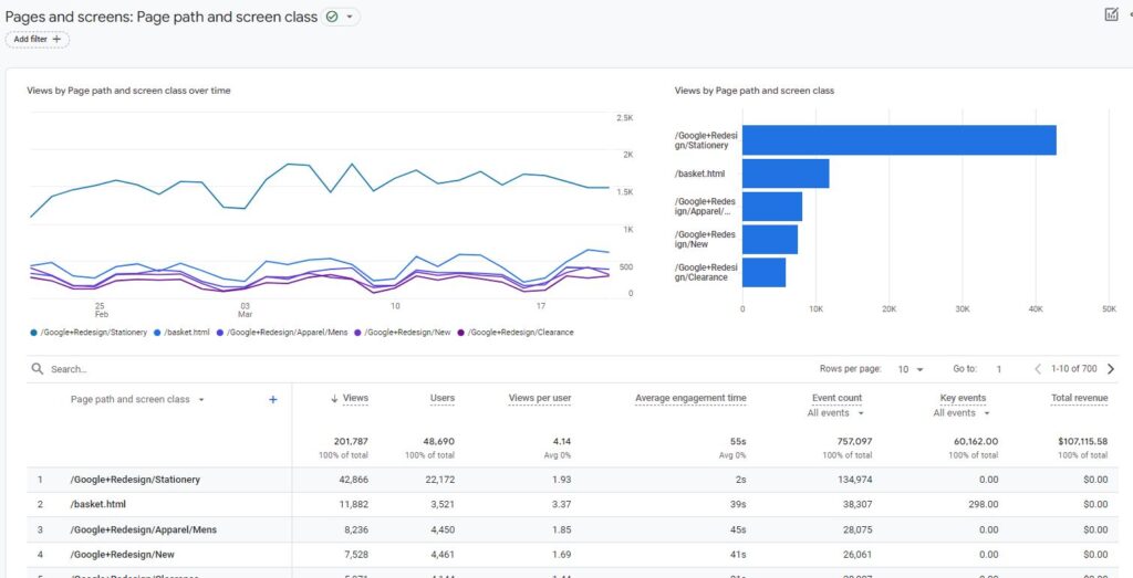
One useful tool that can assist you in understanding the traffic to your website or app is Google Analytics 4 (GA4). Exploration is one way to accomplish this. One of the ways to do this is to use Explorations. Explorations are a type of report that allows you to create custom visualizations of your data.
There are several types of charts available in Explorations, including:
Table chart
Table chars is the standard visualization for all the detailed reports. Data is displayed in a grid format, where each dimension is in a row and corresponding data is shows in various columns.
This form of visualization provides more details about your data and is widely used for all types of data.

Table chart is also the default data visualization in Explore when you select "Blank" or "Free from" explore technique.

Donut chart
Your data is displayed as a donut, with each slice denoting a distinct value. Each slice is the same size as the value it represents. When displaying categorical data, like the breakdown of your traffic by device or country, the donut chart works well.

Line chart
The data is displayed as a line over time in the line chart. When displaying time-series data, like the quantity of users, sessions, or page views over a period of time, a line chart works well. The line chart can be used to spot trends or to compare various metrics over time.
Line chart is available in the standard GA4 reports as well as in the Exploration.

Scatterplot
Your data is displayed as points on a graph in a scatterplot. Every point on the graph represents a single data point, and the values of two dimensions correspond to the point's location. Relationships between two dimensions, such as those between page views and bounce rate or revenue and conversion rate, can be effectively visualized using scatterplots.
Scatter plots are also available in both standard GA4 reports and explorations.

Bar chart
Your data appears as bars in the bar chart. Each bar's height reflects the value it stands for. When comparing various numbers, like the quantity of users by nation or the quantity of sessions by device, a bar chart works well.

Geo map
Your data is displayed on a map via the geo map. The value of the metric for that place is reflected in the color intensity on the map. Visualizing geographic data, like the distribution of your traffic by nation or the locations of your users, is made easier with the help of the geo map.
The kind of data you are attempting to visualize will determine the kind of chart you select. A line chart would be used, for instance, to show how your traffic has changed over time. A geo map would be useful if you wanted to see how your traffic is broken down by country.

Conclusion
You have additional options for your chart's appearance in addition to its type. You can alter the labels, fonts, and colors, for instance. To concentrate on particular data, you can also apply filters to your chart.
With the aid of explorations, you can effectively visualize your GA4 data in a way that speaks to you. Try out a variety of chart types to see which ones suit you the best.
Need Help with GA4?
Our team of experienced professionals are here to help you resolve all your GA4 issues and provide ongoing support so that you can focus on your job. Reach out to us for no obligation consultation. Fill the Contact US form or email us at support@optizent.com
[hubspot type="form" portal="47559418" id="b208ecba-5f40-48f6-9b84-5f5f9bd67e90"]
