TLDR: Use the principles of UX to improve your reporting

A few months ago, I was asked by my boss to figure out if a certain sales motion was profitable. I spent a couple of hours cleaning up the data, running the spreadsheet, and then wrote up an email summary. I then ran into my boss who asked if the motion was profitable. I couldn't remember off the top of my head. I'd spent all of my time on data cleanup . . . Answering the actual question was not on the top of my mind. As analysts, we are conditioned to think about the data. After all, that's how we spend most of our time; cleaning and analyzing the data. Needless to say, he wasn't impressed.
I'd made a classic analytic mistake, confusing the process with the outcome.
A framework to avoid this kind of mistake is user centered analytics. Understanding who is going to read a report and how it will be used, will dramatically increase your value as an analyst.
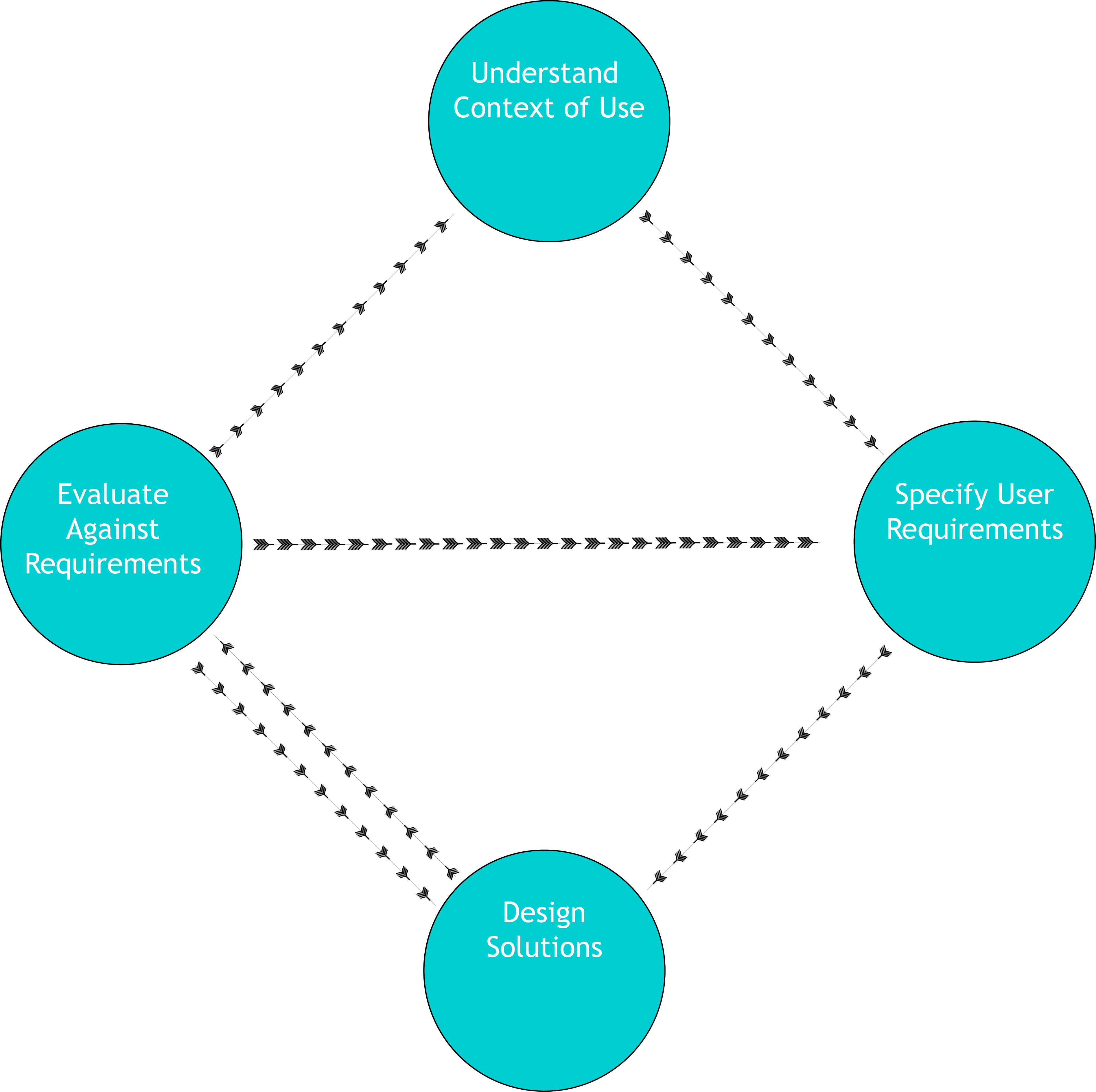
To do this, we can take the principles of User Experience Design (UXD) and apply them to analytics presentation.
UXD is an iterative design process, which means the emphasis is on continuous improvement. That means a report built today using these principles will be worse than a report built in 6 months if you follow the process.
The most relevant part of UXD for analytics is that you need to understand the context of use of any product you create. Think about who is consuming the report, and how?
Will it be a slide in a larger slide deck?
Is it for internal customers or external customers?
How data literate is the audience?
How senior are they?
Focus on who your customer is and what their needs are. Oftentimes we are asked to produce something incredibly specific. Take a minute to understand why they're asking for it? Oftentimes they're trying to answer the question and they think that the information they're asking for is going to answer it. Get them to ask you the question instead, and you'll work out how to answer it.
Once you understand the context of use, you can then specify user requirements. In analytics, this is pretty easy to do, does it answer the question at a level meaningful to the user? A report for the CEO probably shouldn't be as into the data weeds as one for the head of a specific marketing campaign.
[mc4wp_form id="517"]
Once we've built the report, we need to check to see if it satisfies those user requirements. Does it answer the actual question? Is it in an appropriate level of detail? If it's part of a larger report, does it fit well in context with the rest of the report? Having a colleague review your work can really help make sure it's doing everything it's supposed to.
Lastly, you take all the work you just did, and iterate on it, so the next time you do it, it's better.
This process doesn't have to be lengthy, especially after you're used to doing it but building a user centered process can really improve the quality of your reporting.
A key part of any analyst's job is to answer questions. Shouldn't we actually make sure the answers make sense to their intended audience?
Charles Mendelson is a marketing data analyst at PitchBook. He’s worked in and around sales and marketing organizations for the last five years and has succeeded at a number of job interviews (and failed at way more). He’s also getting a masters degree in psychology from the Harvard Extension School. If you’re looking for a speaker for a conference or seminar or if you’d like to ask any questions you can connect with him on LinkedIn: where he sometimes publishes articles.
[mc4wp_form id="517"]
