
Google Analytics 4 (GA4) is the latest version of Google Analytics, and it offers a number of new features and capabilities. One of these features is the ability to change the graph type in default reports. This can be useful for visualizing your data in a way that is most meaningful to you.
Go to the report that you want to customize
To change the graph type in a default report, you must first go to the report that you want to customize. You can find the default reports in the Reports section of the GA4 interface. From the left-hand sidebar, select the report that you want to customize. This could be a default report like "Events," "Conversions," or any other report available in GA4.
Click the pencil icon in the top right corner of the report.
Once you are viewing the report that you want to customize, click the pencil icon in the top right corner of the report. This will open the report editor.
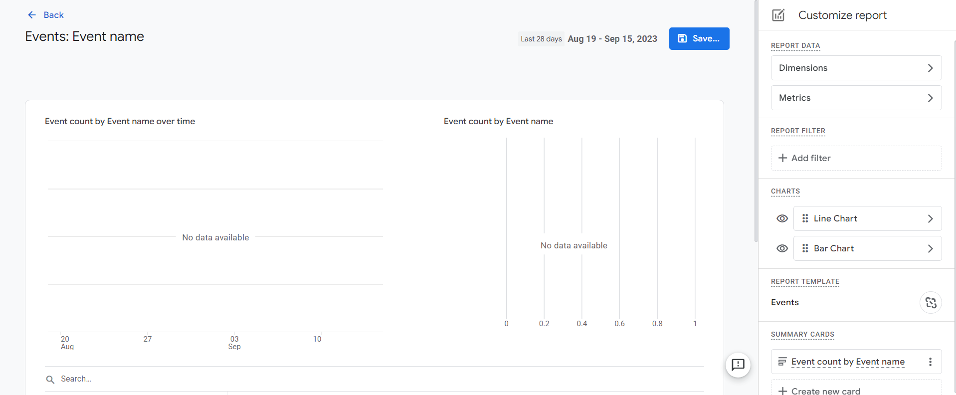
In the Charts section, click the Change chart type link for the chart that you want to change.
In the Charts section of the report editor, you will see a list of all of the charts that are included in the report. To change the graph type for a particular chart, click the Change chart type link next to the chart.
Select the desired chart type from the menu list.
Once you have clicked the Change chart type link, a list will appear. This contains a list of all of the available chart types. Select the desired chart type from the list.
Click Save.
Once you have selected the desired chart type, click the Save button to save your changes.

Customizing graph types in default reports offers several benefits for data analysis in Google Analytics 4:
Improved Data Interpretation
Different types of data are better suited to specific graph formats. By choosing the appropriate graph type, you can visualize your data in a way that makes patterns and trends more apparent.
Enhanced Clarity
Graphs provide a visual representation of data that is often easier to understand than raw numbers or tables. This can make your reports more accessible to stakeholders and decision-makers.
Better Decision-Making
Clear, well-presented data can lead to more informed decisions. When you can easily spot performance trends or anomalies, you can take proactive steps to optimize your website or marketing efforts.
Tailored Reporting
Customizing graph types allows you to present data in a way that aligns with your specific business goals and KPIs. This tailoring ensures that your reports are highly relevant to your objectives.
Data Storytelling
Different graph types lend themselves to different storytelling techniques. For instance, pie charts are great for showing proportional data, while line charts excel at illustrating trends over time. This enables you to craft more compelling narratives around your data.
Customizing the graph type in default reports in Google Analytics 4 is a valuable skill for anyone looking to harness the full power of their analytics data. By selecting the right graph type, you can transform raw data into actionable insights that drive business growth and website optimization. Experiment with various graph types, explore the nuances of your data, and use customization to tailor your reports to your specific needs. In doing so, you'll unlock the true potential of Google Analytics 4 and gain a deeper understanding of your online performance.
Need help with GA4?
Contact us at support@optizent.com or fill out the form at the Contact Us page
Learn GA4 at your own pace
Check out our complete GA4 course on Optizent Academy, GA4 Zero To Hero - Complete Google Analytics 4 course